Turn your data into stunning visualizations in seconds
Features
Transform your data into stunning visual stories with AI
No Technical Expertise Required
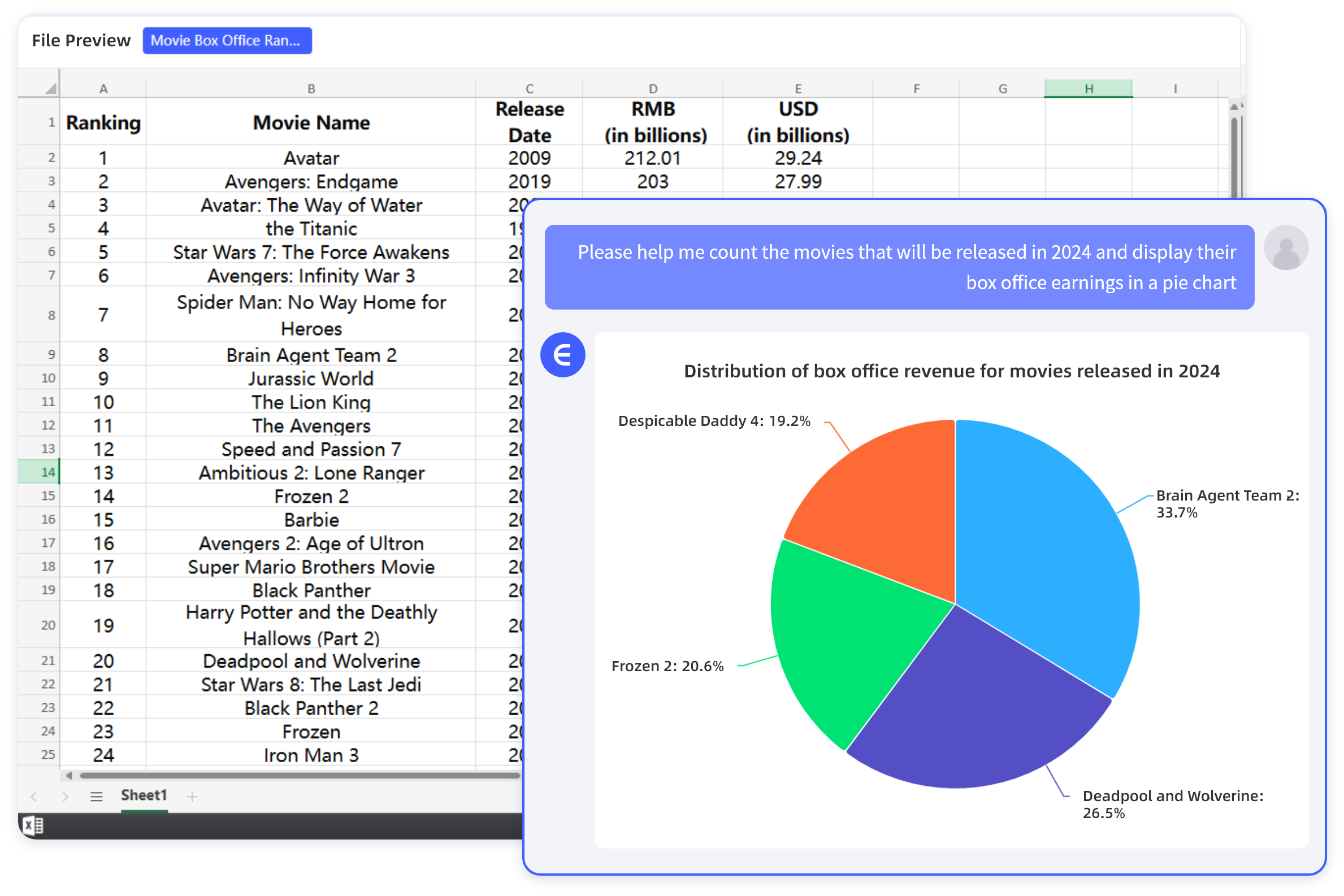
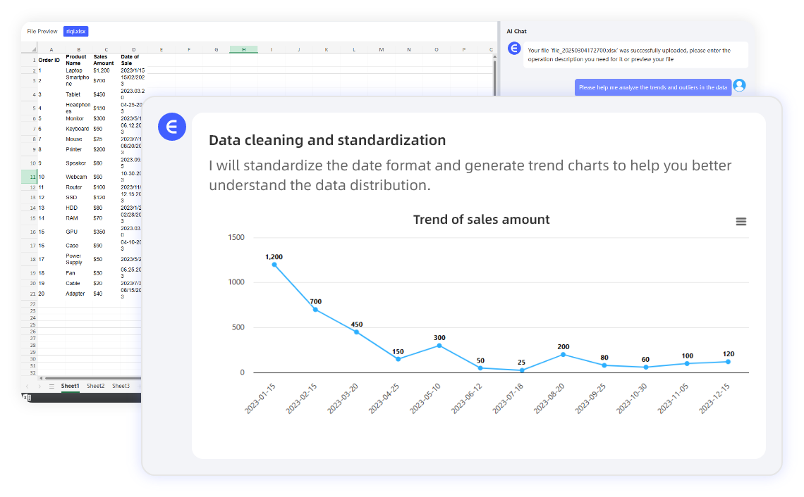
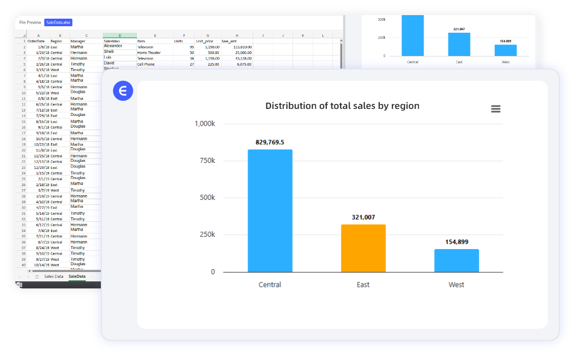
"Show sales trends as a line chart" or "Compare regional revenue with a bar graph" – type your request, and AI generates visuals instantly. Perfect for teams, students, and professionals who need clarity without complexity.
Wide Range of Chart Types
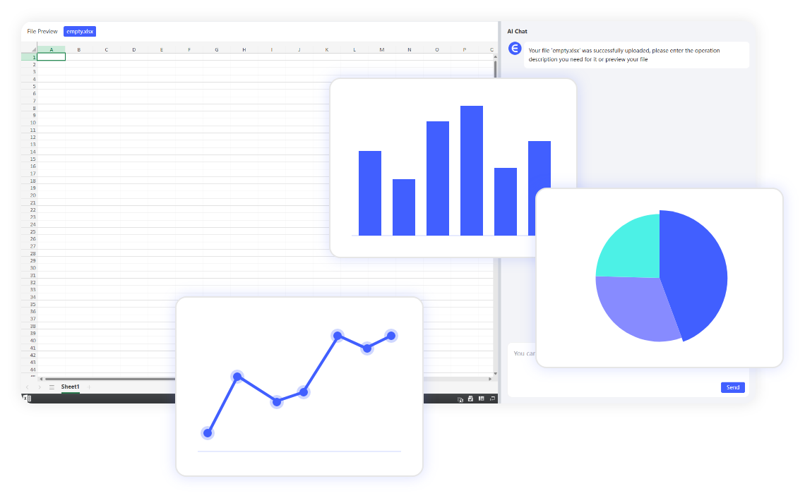
AI supports bar charts, pie charts, line graphs, scatter plots, heatmaps, histograms, and more. Need a custom design? Just ask!
Smart Customization
Adjust colors, labels, and styles with simple commands like "Make the bars blue," "Add a title to the chart," or "Highlight Q4 data." Automatically optimize visuals for presentations, reports, or social media.
Real-Time Collaboration
Share interactive charts with stakeholders and let them request changes via chat—no back-and-forth emails.
Process
How It Works
Why Choose Us
Reasons to Choose Excelmatic
Expert help, instantly
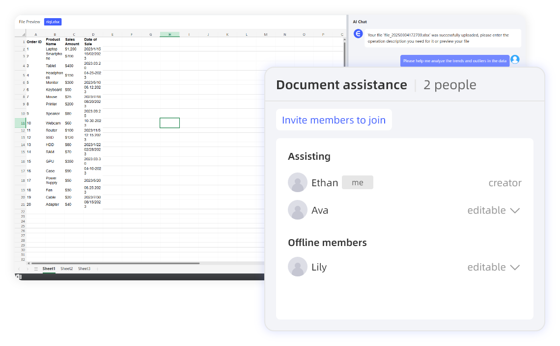
Get the spreadsheet guidance of an expert, on-demand. No more scouring forums or help docs - just ask your Assistant for instant help.
Right where you work
No switching between apps or learning new tools. Access the power of AI assistance seamlessly, right in your familiar spreadsheet interface.
Answer complex questions
Beyond just helping with formulas or one-off tasks, your Assistant provides proactive data insights and strategic spreadsheet guidance.
Tailored to your needs
Your AI Assistant helps you build any spreadsheet from scratch. From formatting to pivot tables, Excelmatic has you covered.
Use Cases for Every Industry
See how professionals across different fields turn data into impactful visuals with Excelmatic.
Business Teams
Turn quarterly reports into interactive dashboards. Visualize performance metrics and KPIs for executive presentations with no design skills required.
Educators
Visualize student performance trends for parent meetings. Create engaging visual aids for lessons and academic presentations.
Marketers
Create campaign ROI graphs for stakeholder reviews. Visualize audience demographics and engagement metrics across channels.
Researchers
Plot survey data into scatter plots or histograms. Transform complex datasets into publication-ready visualizations.
Common Questions About Our Charts & Graphics
Can I edit charts after generating them?
Yes! Chat with AI to tweak designs, update data, or switch chart types anytime.
Is my data safe?
Absolutely. Files are processed securely and never stored after your session.
What Excel versions are supported?
Excelmatic works with all .xlsx, .xls, and .csv files.
Can I create interactive dashboards?
Yes! Ask the AI to "Build a dashboard with sales, expenses, and profit charts" to auto-generate a multi-visual report.
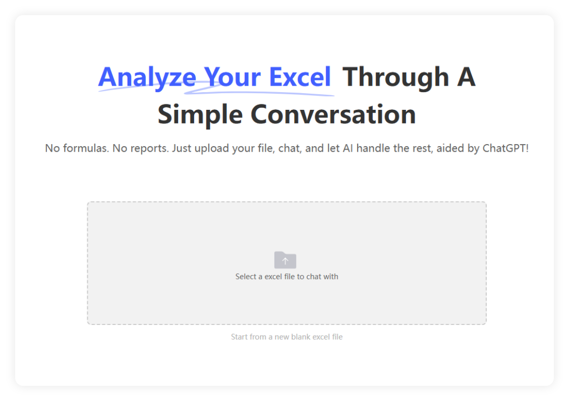
Ready to Visualize Smarter?
Upload your Excel file now and let AI turn data into insights you can see!
✨ Start Free Trial ✨